Birth of an Aesthetic

This post is a sequel to Invisible Storytelling. I encourage you to read that one first, especially if your main industry isn't media/creative. It covers some ‘visual arithmetic’ that gives a foundation to this post’s ‘visual algebra’.
Invisible storytelling focused on creative problem solving that is universal to film production. This post focuses on the aesthetic I've developed for Visual Handprint and its unique challenges and opportunities.
Intro
I’m a voracious podcast listener. It struck me as strange to me that with podcasting on track to be a billion-dollar industry in 2021, no studio specialized in podcast trailers. After all, even the most indie and arthouse films recognize the essential role of a movie trailer.
Why aren’t there show trailers for the top 50 podcasts?
This question launched my startup, Visual Handprint.
I wanted to bring the creative energy of a music video to words from a podcast. I set out to film a live-action version of what’s typically done by animated explainer videos. My goal was to bring the textures of reality to a format overrun with sterile animations.
In this post, I walk you through the stages of how my aesthetic evolved. I started with two podcast trailer ‘specs’ (slang for proof of concept tests). The specs generated interest that led to an explainer series, then a social media campaign. Along the way, I’ll share the revelations that improved my process and the misfires that became valuable lessons.
To connect visual concepts to more relatable terrain, I often use written language as an analogy. Through the videos I’ve made, my visual literacy has improved.
Visual literacy refers to the clarity of the final video seen by the audience. If the audience doesn’t understand a scene, it’s due to a shortcoming in the visual literacy of the scene.
We associate ‘literacy’ with written words. Visual communication goes much deeper. Humans are innately visual creatures, but unless we study design, film, or the visual arts, most of us have limited terminology for visual concepts. We can feel what makes a scene ‘cool’ or ‘confusing’ intuitively and viscerally, but without the words to describe it.
A confusing story is the fault of the author, not the audience. Clarity is the responsibility of the communicator. As mentioned above, the language of visual storytelling should feel intuitive.
My storytelling aesthetic has grown from one-off vignettes (the disconnected visual equivalent of sentence fragments) to full story arcs (the visual equivalent of thematically linked paragraphs).
For the first experiment I made in this aesthetic, I chose Debbie Millman’s “Busy is a Decision” excerpt from the Tim Ferriss Show and set out to make a spec trailer from it. This particular segment was what inspired my idea for a podcast trailer. I wanted to amplify Debbie’s call to honesty: that rather than hide behind the self-important badge of ‘busy’, we need to make time for what matters.
My objective was to see if metaphors could bring ideas that aren’t inherently visual to life. Could the visuals be done so they enhanced the audio, rather than distracted from it?
These questions led me to the blunt reality of tortilla surface areas...
Stage 1: The Specs
Spec #1: Busy is a Decision
Hand painting legible red letters onto a flour tortilla is tricky.

When you add the complexity of spacing out letters so they match the shape of their larger smear letters it becomes nearly impossible.
Yet despite odds stacked against us, this tortilla scene worked on a technical level. My friend Harry’s dexterity from writing Chinese characters overcame the legibility and spacing hurdles. The scene functioned exactly as I wrote it.
Although the effect I wrote was a cool vignette, it was completely unrelated to the meaning of the audio. The fail was my ‘visual algebra’.
Wait, what? Visual algebra?
Soon this concept will be its own article. For those interested there’s a brief crash course below:
Visual Algebra refers to my behind-the-scenes ideation process that is unseen by the audience.
To me, the process of ideation has always felt more like mathematics than writing. I think of visual metaphors as an equation:
The source voiceover is on one side of an equals sign (=) and my visual ideas are on the other.
ie.) Voiceover = Visual Ideas
Do the visual metaphors add up? Does the overall equation balance out?
If the voiceover says “make time for what matters” and I show a purple giraffe eating garbage… the visual algebra doesn’t balance out:
ie.) Make time for what matters ≠ purple giraffe eating garbage
In contrast, “make time for what matters” DOES balance out with a visual of a clock onscreen.
ie.) Make time for what matters = clock
With that context, let’s revisit the tortilla one final time ...
Growing Pains
The tortilla scene (and much of the Busy Is A Decision video) works in a flashy way, not a grounded one. You’re hearing a woman speak about being busy and seeing…. A tortilla?
That’s a dissonant duality of metaphor. The visual algebra doesn’t add up.
The majority of the visuals in Busy is a Decision video were hollow as the whiteboard animations I aimed to surpass. The words I showed on-screen matched the words spoken. That was the level of depth for most of the video.
Revelation
This first video proved there was something to pursue further in its aesthetic and format. Everyone who saw it had an eager appetite for more.

Whip-pan cinematography brilliance by Cole Jackson

The analog charm of the map cutout lettering is one of my fav moments
Some scenes like the texting sequence and the map and watch shots really did harmonize the words and visuals. The medium matched the message. When I set out to make a second podcast trailer, this is where I wanted to double down.
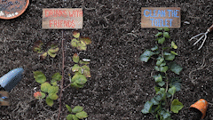
Spec #2: Just Run
Growing Pains
There’s a fun garden scene in this video. Editing the scene I discovered a problem. The scene’s visual algebra only adds up if you’ve heard the voiceover in its entirety. To a first-time viewer, it doesn’t make sense. It only makes sense when you know the ending.
This issue only became possible when I moved from vignettes (sentence fragments) to scenes (multiple sentences). Continuity isn’t a factor when each sentence is a self-contained visual idea.
As the writer who already knows the full context, I’m biased. This scene emphasized how I need to double-check longer sequences to make sure they add up in real-time.
Revelation
The ‘running salad’ sequence is almost always people’s favourite part of this video. It maintains the playful absurdity of the tortilla… BUT this time the visuals are thematically relevant.
This sequence cemented what’s now one of my core visual principles: progressive complexity. Use simple visuals when voiceover ideas are unorthodox/new. Conversely, when the voiceover ideas are basic/familiar the visuals can require more concentration.
The pace of this sequence accelerates alongside the voiceover. It feels smooth because you’re familiar with the connection of salad bowl = running metaphor. Each new setting (microwave, fridge, shower) builds upon an established foundation. As the voiceover becomes simpler, there’s more space for visual absurdity.
The key discovery from my two specs was the value of visualizing in sequences.
I had thought short tableaus, where each idea has its own shot, would be easier to follow and more entertaining. It turned out the longer I could extend a metaphor, the better.
Stage 2: The Series
LandGeek (Explainer Series)
Derek Sivers shared the second spec, Just Run, with his newsletter. I woke up to emails from around the world with kind words and professional opportunities. One of these voices in my inbox was Mark Podolsky, aka The LandGeek — a land investor, author, and podcast host. Together we made a three-video series.


My revelation on the first two specs was that while short sentence-by-sentence visualizations are easier to produce, the resulting video feels more shallow. They also can be choppy and difficult to follow.
In this new series, I was eager to show the full action of a scene in a single take. Visual sequences look more impressive. They’re also easier to follow as an audience.
But sequences are much more difficult from a technical/dexterity standpoint. More can go wrong the longer you’re rolling. Then you have to reset and restart.
Ideation is also more difficult for visual sequences. You need metaphors to carry long durations while still being engaging and relevant. This means your visual algebra has to be sharp. But sequences deliver the best narrative clarity for the audience, so it’s worth the time investment.
Revelation
There’s a huge benefit to planning multiple videos upfront. Within my aesthetic, the key story work is done in ideation. When it’s done comprehensively we can create an over-arching story world.
My production designer Tanner and I cross-pollinated props, characters and visual themes across the series. It feels much more immersive and has a cohesive narrative presence that would not be possible through three one-off videos.
Stage 3: The Campaign
Make It (Social Media Campaign)
I met Jenna Herbut (founder of Make It) at an event she hosted for Vancouver Startup Week. Jenna’s tradeshow, Make It, gathers artisanal vendors into a single venue for shoppers to buy everything from local designer chocolate bars and hot sauces to belts, stationery, and clothing.
We spoke about how my aesthetic would be a great match for the handmade, playful feel of her brand, and set out to make a social media campaign together.
This project excited me as a pure aesthetic test.
The Visual Handprint videos I’d made up to this point had the scrappy charm of ambition. This one I wanted to hold up as a polished commercial.
Revelation
Coming into this project I was excited to experiment with a modular design. Here’s an excerpt from my creative proposal:
To make an evergreen video, I love the approach of modular design. We can shoot a series of vignettes, 9sec each, for 5 key categories of Make It [food, jewelry, body care, etc.]. We’ll also shoot a 5sec intro clip in both a winter holiday + perennial theme. When linked as a group (intro + vignettes) you’ll have a strong 50sec commercial. You’ll also receive each vignette as a freestanding individual video that ends with the Make It logo.
By adopting modular design, we were able to make two Make It commercials. The beauty of the modular design was it enabled Jenna’s team to use the videos in a variety of ways.

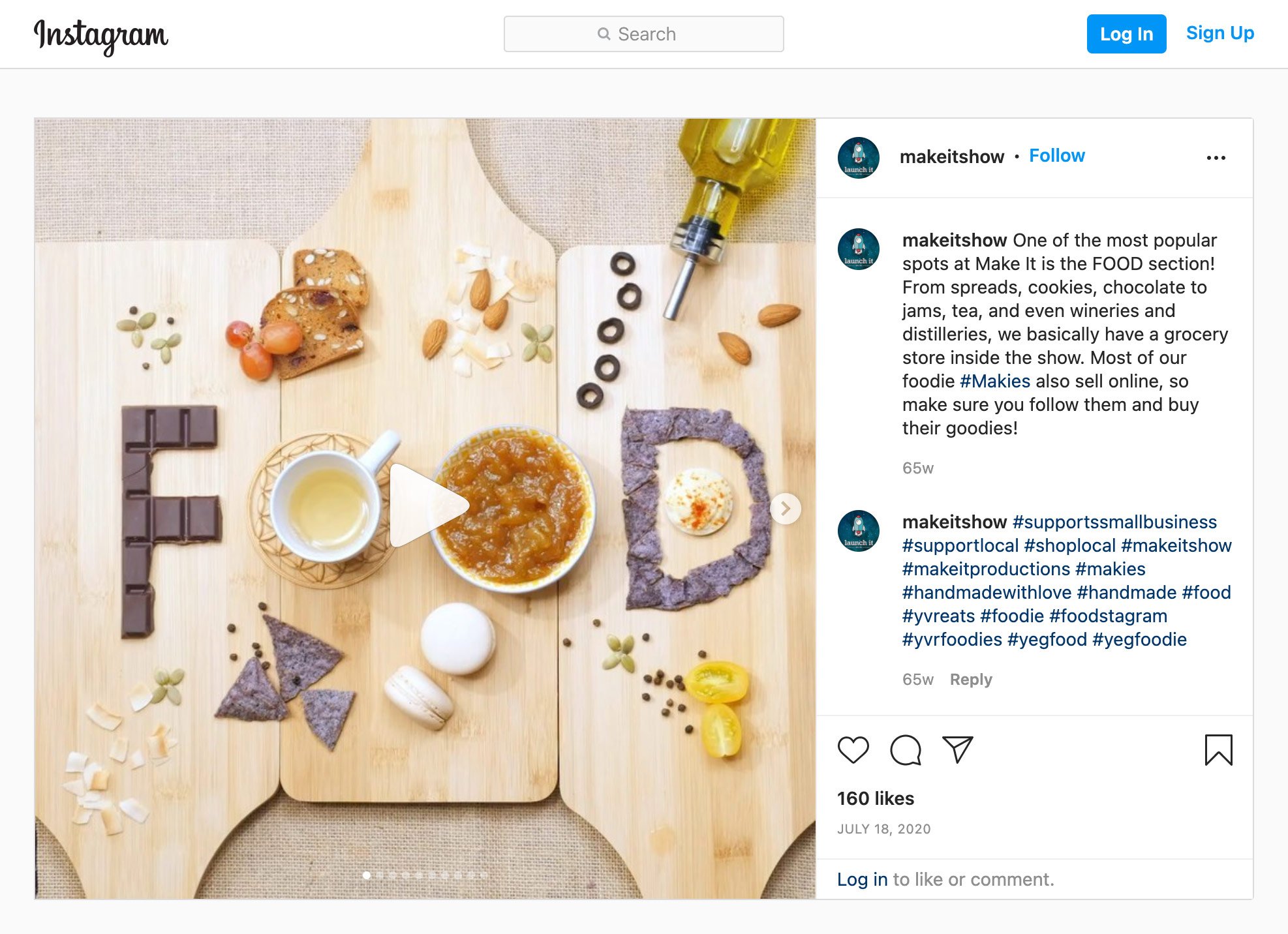
The category vignettes became both GIFs on her site and category openers on social media.
I’m really proud of how good these shots look. Our production designer Danica did an amazing job at prepping the tableaus and finding creative workarounds to bring the scenes to life.


The brilliant team I work with figured out the cardboard and cloth frame engineering to make this scene possible. Collaboration is a wonderful thing.
What’s Next?
There are so many cool possibilities for this aesthetic. The original vision of trailers to visualize the invisible audio of podcasts and audiobooks remains my core ambition. But along the journey of this aesthetic other exciting ideas have sparked:
Children enjoy the playfulness of this style when I show it to them. It’d be fun to create videos that explore complex ideas in a way that’s accessible for young minds.
On the other side of the spectrum, some subjects like factory farming have gag orders that prevent video journalists from documenting brutal realities. Even if you could show it, harsh footage makes most people bristle and put up a guard. There’s a powerful opportunity to explore difficult subjects with an aesthetic that feels real (not animated) but has enough abstraction to keep the focus on big picture concepts.
Eager reception of my concepts like ‘visual algebra’, has shown an opportunity to codify my visual mental models and frameworks into further resources. The idea of creating a cohort-based course and community for visual storytelling excites me.
And of course, there are all the startups, brands, and innovative new products/services that need to explain new or complex concepts in an engaging way.
I’m excited to share GIFs and revelations from the next wave of projects with you soon. Till then, here’s a link to my Twitter where I’m exploring these ideas in public.
P.S. If you enjoyed the GIFs, I encourage you to check out the full YouTube versions embedded throughout the piece, or on my video page.
Huge thanks to Arthur Plainview, Michele Serro, Trisha Reddy, Aakash Gupta, Claire Piper, Lyssa Menard, Laila Faisal, and Michael Dean for a wealth of feedback on this piece.